
Introduction on Diagrammatic and Graphic Representation

In sociological research, data collection and analysis are fundamental to understanding social phenomena. However, raw data alone may not effectively communicate patterns, trends, or relationships. To make data more accessible and interpretable, sociologists use various diagrammatic and graphic representations. These visual tools help summarize complex data, highlight key findings, and facilitate comparisons.
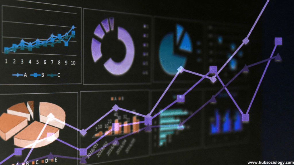
This article explores different methods of data representation in sociology, including frequency tables, bar graphs, pie charts, histograms, and polygons. Each of these techniques serves a unique purpose in presenting quantitative and qualitative data in a structured and visually appealing manner.
Table of Contents
1.1 Frequency Table
Definition and Purpose
A frequency table is a systematic arrangement of data that shows the number of occurrences (frequency) of each distinct value or category. It is one of the simplest yet most effective ways to organize raw data, making it easier to identify patterns and distributions.
Types of Frequency Tables
- Simple Frequency Distribution: Lists each category and its corresponding count.
- Example: Number of students preferring different subjects.
- Grouped Frequency Distribution: Used for continuous data where values are grouped into intervals (class intervals).
- Example: Age distribution of survey respondents.
Advantages in Sociology
- Simplifies large datasets.
- Helps in calculating measures like mean, median, and mode.
- Useful for preparing further graphical representations.
Limitations
- May lose individual data points in grouped distributions.
- Less visually engaging compared to graphs.
1.2 Bar Graph and Pie Chart

Bar Graph
Definition and Structure
Rectangular bars with lengths or heights that represent the frequency or percentage of each category are used in bar graphs to display categorical data.
Types of Bar Graphs
- Simple Bar Graph: Displays single data series.
- Example: Crime rates in different cities.
- Multiple Bar Graph: Compares multiple categories side by side.
- Example: Male vs. female literacy rates across states.
- Stacked Bar Graph: Shows part-to-whole relationships.
- Example: Proportion of different social classes in urban and rural areas.
Advantages in Sociology
- Easy to interpret and compare categories.
- Effective for nominal and ordinal data.
- Visually appealing for presentations.
Limitations
- Not suitable for continuous data.
- Can become cluttered with too many categories.
Pie Chart
Definition and Structure
A circular graph with slices that each reflect a distinct proportion of the total is called a pie chart. The size and angle of each slice show the frequency or percentage of the category.
When to Use a Pie Chart
- When showing composition (e.g., religious distribution in a population).
- When comparing parts of a whole (e.g., income distribution among social groups).
Advantages in Sociology
- Clearly shows proportional relationships.
- Simple and intuitive for non-technical audiences.
Limitations
- Difficult to compare small differences.
- Becomes ineffective with too many categories.
- Less precise than bar graphs for exact comparisons.
1.3 Histogram and Polygon
Histogram
Definition and Structure
Though it depicts continuous data, a histogram is comparable to a bar graph. The bars (bins) are adjacent and correspond to class intervals on the x-axis, while the y-axis shows frequency density.
Key Features
- No gaps between bars (unlike bar graphs).
- Area of each bar represents frequency.
- Used for interval or ratio data (e.g., age, income, test scores).
Example in Sociology
- Income distribution in a community.
- Age-wise population analysis.
Advantages
- Shows data distribution and skewness.
- Identifies central tendencies and outliers.
Limitations
- Sensitive to bin width selection.
- Can be misleading if intervals are not uniform.
Frequency Polygon
Definition and Structure
A line graph created by joining the midpoints of the top of each bar in a histogram is called a frequency polygon.
Key Features
- Smooth representation of data trends.
- Useful for comparing multiple distributions.
Example in Sociology
- Comparing literacy rates across different age groups.
- Analyzing crime trends over decades.
Advantages
- Easier to compare multiple datasets.
- Smooth curve helps visualize trends.
Limitations
- Less precise than histograms for exact frequencies.
- Can be confusing if too many lines overlap.
Conclusion on Diagrammatic and Graphic Representation
Diagrammatic and graphic representations are indispensable tools in sociological research. Frequency tables provide a structured summary of data, while bar graphs and pie charts help visualize categorical comparisons. Histograms and polygons are essential for understanding distributions in continuous data.
Choosing the right method depends on the nature of the data and the research objectives. Properly constructed diagrams enhance clarity, support statistical analysis, and make findings accessible to a broader audience. Sociologists must master these techniques to present data effectively and derive meaningful insights from social research.
By integrating these graphical tools, sociological studies can communicate complex social patterns in an engaging and interpretable manner, bridging the gap between raw data and actionable knowledge.
Topic Related Questions on Diagrammatic and Graphic Representation
5-Mark Questions on Diagrammatic and Graphic Representation (Short Answer Type)
- What is a frequency table? Explain its importance in sociological research.
- Differentiate between a bar graph and a pie chart with suitable examples from sociology.
- Why is a histogram preferred over a bar graph for representing continuous data?
- Explain the construction of a frequency polygon with an example.
- What are the advantages of using graphical representation in sociological studies?
10-Mark Questions on Diagrammatic and Graphic Representation (Descriptive Answer Type)
- Discuss the different types of frequency tables used in sociology. Provide examples for each.
- Compare and contrast bar graphs and pie charts. Which one is more effective in sociological research and why?
- Explain the steps involved in constructing a histogram. How does it help in understanding social data?
- What is a frequency polygon? How is it different from a histogram? Illustrate with an example.
- Critically evaluate the use of diagrams and graphs in presenting sociological data. What are their limitations?
15-Mark Questions on Diagrammatic and Graphic Representation (Long Answer/Essay Type)
- “Graphical representation simplifies complex sociological data.” Discuss this statement by examining different types of diagrams and their applications.
- Explain the significance of frequency tables, bar graphs, and histograms in sociological research. Support your answer with appropriate examples.
- How do histograms and frequency polygons assist in analyzing social trends? Compare their utility with other graphical methods.
- Discuss the role of visual data representation in sociology. Which methods are most suitable for qualitative and quantitative data?
- “A well-constructed diagram speaks louder than raw data.” Critically analyze this statement in the context of sociological research.